Cluster analysis or clustering is the task of grouping a set of objects in such a way that objects in the same group (called a cluster) are more similar (in some specific sense defined by the analyst) to each other than to those in other groups (clusters). It is a main task of exploratory data analysis, and a common technique for statistical data analysis, used in many fields, including pattern recognition, image analysis, information retrieval, bioinformatics, data compression, computer graphics and machine learning.
Code
import pandas as pdimport matplotlib.pyplot as pltfrom sklearn.compose import ColumnTransformerfrom sklearn.preprocessing import OneHotEncoder, StandardScalerfrom sklearn.cluster import KMeansfrom yellowbrick.cluster import*# for clustering diagnosticsfrom sklearn.metrics import silhouette_scoreimport warnings# Suppress all warningswarnings.filterwarnings("ignore")# reading datadf = pd.read_csv('customer_segmentation.csv')df = df.dropna()# Automatically select categorical and numerical columnscategorical_cols = df.select_dtypes(include=['object', 'category']).columnsnumeric_cols = df.select_dtypes(include=['int64', 'float64']).columns# Create a ColumnTransformerpreprocessor = ColumnTransformer( transformers=[ ('num', StandardScaler(), numeric_cols), ('cat', OneHotEncoder(sparse_output=False, handle_unknown='ignore', drop=None, dtype=float), categorical_cols) ])# Fit and transform the datadata_processed = preprocessor.fit_transform(df)
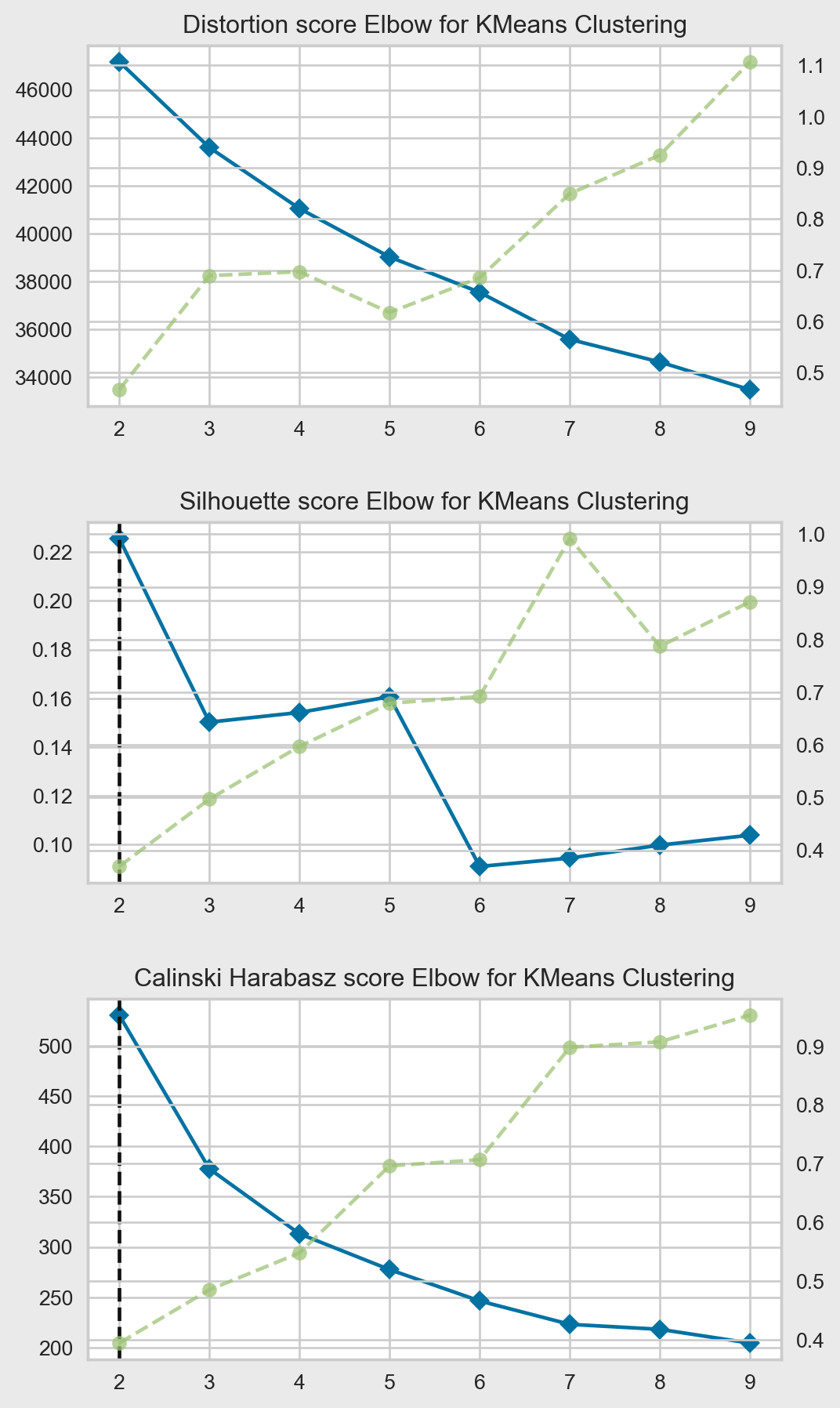
Elbow point
The curvature of the distortion score curve can be calculated as the second derivative of \(D(k)\) with respect to \(k\):
\[\text{Curvature} = \frac{d^2 D(k)}{dk^2}\]
The elbow point is the value of \(k\) where the curvature is maximized, i.e., the point where the second derivative is equal to zero and the first derivative is changing most rapidly:
\[\frac{d^2 D(k)}{dk^2} = 0\] and \[\left|\frac{d D(k)}{dk}\right| \text{ is maximized}\]
In practice, since we are working with discrete values of \(k\), we can approximate the curvature using finite differences:
The value of \(k\) that maximizes this expression is considered the elbow point.
Code
clusters_range =range(2,10)bg ="#EAEAEA"fig, ax = plt.subplots(nrows=3, ncols=1, figsize=(7, 10))fig.tight_layout(pad=3)fig.set_facecolor(bg)km = KMeans(init='k-means++', n_init=12, max_iter=100, algorithm='elkan')# Distortion: mean sum of squared distances to centerselb = KElbowVisualizer(km, k=clusters_range, ax=ax[0], locate_elbow=True,n_jobs=1)elb.fit(data_processed)# ax[0].legend(loc='upper left')ax[0].set_title('Distortion score Elbow for KMeans Clustering')# Silhouette: mean ratio of intra-cluster and nearest-cluster distancesil = KElbowVisualizer(km, k=clusters_range, metric='silhouette', locate_elbow=True, ax=ax[1],n_jobs=1)sil.fit(data_processed)# ax[1].legend(loc='upper left')ax[1].set_title('Silhouette score Elbow for KMeans Clustering')# Calinski Harabasz: ratio of within to between cluster dispersioncal = KElbowVisualizer(km, k=clusters_range, metric='calinski_harabasz', locate_elbow=True, ax=ax[2],n_jobs=1)cal.fit(data_processed)# ax[2].legend(loc='upper left')ax[2].set_title('Calinski Harabasz score Elbow for KMeans Clustering')plt.show()
Distorsion
The distortion score is a metric used to evaluate the quality of a clustering model, specifically the K-Means algorithm. It measures the average squared distance between each data point and its assigned cluster centroid.
\(c_j\) is the centroid of the cluster that \(x_i\) belongs to
The sum is taken over all \(n\) data points
The \(\|x_i - c_j\|^2\) term represents the squared Euclidean distance between the data point \(x_i\) and its assigned cluster centroid \(c_j\)
The final result is the average of these squared distances across all data points
The goal of the K-Means algorithm is to find cluster assignments that minimize this distortion score, i.e., to group data points such that the average squared distance to their assigned centroids is as small as possible. A lower distortion score indicates better clustering quality.
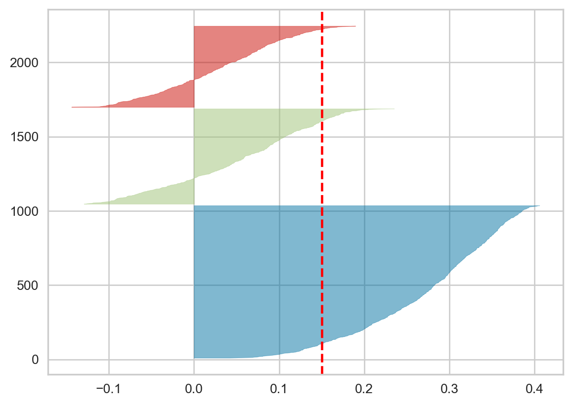
Silhouette coefficient
\[s(i) = \frac{b(i) - a(i)}{max(a(i), b(i))}\]
where:
\(s(i)\) is the Silhouette coefficient for the \(i\)-th sample.
\(a(i)\) is the mean distance between the \(i\)-th sample and all other samples in the same cluster.
\(b(i)\) is the mean distance between the \(i\)-th sample and all other samples in the next nearest cluster.
The Silhouette Coefficient ranges from -1 to 1, where a high value indicates that the sample is well-matched to its own cluster and poorly-matched to neighboring clusters. A value of 0 generally indicates overlapping clusters, while a negative value indicates that the sample may have been assigned to the wrong cluster.
When the Silhouette coefficient \(s(i)\) is negative, it means that the average distance \(a(i)\) of the \(i\)-th sample to other samples in its own cluster is greater than the average distance \(b(i)\) to the nearest neighboring cluster. This suggests that the \(i\)-th sample would be better assigned to the nearest neighboring cluster rather than its current cluster.
In the Silhouette plot, clusters with bars that extend into the negative range indicate that some samples within those clusters have been poorly assigned. The wider the negative portion of the bar, the more samples in that cluster have been misclassified.
The presence of negative Silhouette Coefficient values is a sign that the clustering algorithm has not been able to find well-separated, dense clusters. It suggests that the number of clusters \(K\) may not be appropriate for the data, or that the clustering algorithm is not a good fit for the dataset. In such cases, the Silhouette plot can be used to guide the selection of a more appropriate value of \(K\) or the choice of a different clustering algorithm.
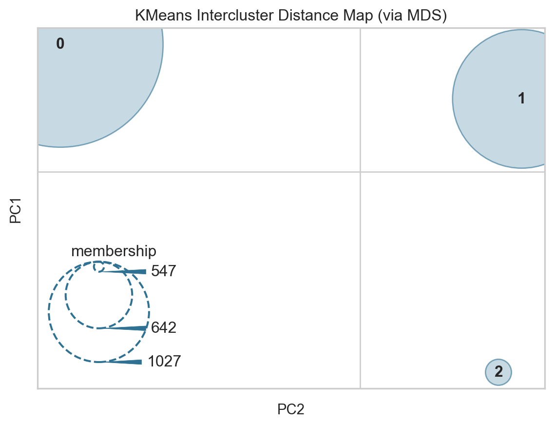
Let’s assume we have a dataset \(X \in \mathbb{R}^{n \times d}\) with \(n\) samples and \(d\) features, and a clustering model that has identified \(k\) clusters with centers \(\mathbf{c}_i \in \mathbb{R}^d, i=1,\dots,k\).
The goal of the intercluster distance map is to embed these \(k\) cluster centers into a 2-dimensional space \(\mathbf{z}_i \in \mathbb{R}^2, i=1,\dots,k\), while preserving the distances between the clusters in the original high-dimensional space.
Mathematically, this can be expressed as finding an embedding function \(f: \mathbb{R}^d \rightarrow \mathbb{R}^2\) such that the distances between the embedded cluster centers are as close as possible to the distances between the original cluster centers:
The size of each cluster’s representation on the 2D plot is determined by a scoring metric, typically the “membership” score, which is the number of instances belonging to each cluster:
\[s_i = |\{x \in X | \text{label}(x) = i\}|\]
Where \(\text{label}(x)\) is the cluster assignment of the \(x\)-th sample.
The final intercluster distance map visualizes the 2D embedded cluster centers \(\{\mathbf{z}_i\}_{i=1}^k\), with the size of each cluster proportional to its membership score \(s_i\).
This allows us to gain insights into the relative positions and sizes of the identified clusters, and the relationships between them in the original high-dimensional feature space.